The Sad Percentage Of Air Per Bag Of Chips
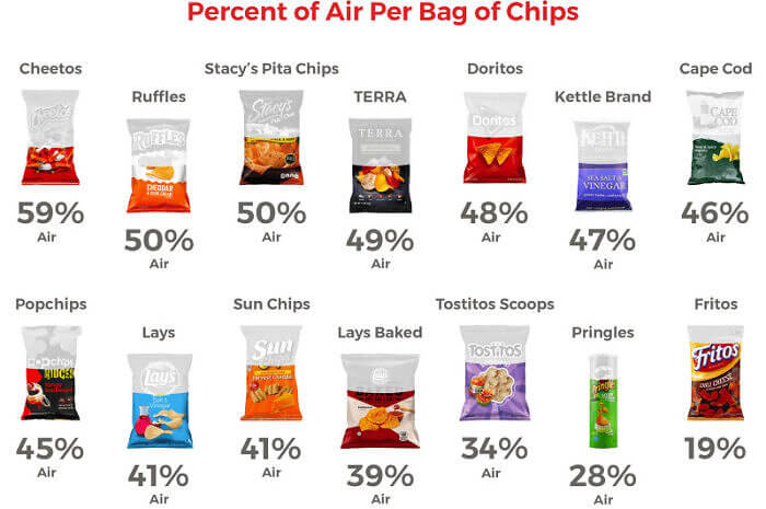
When food fools us, we feel incredibly cheated. The worst offenders in the industry are definitely the chip bags. How many times have you opened a snack only to realize half the package was air? It's a cheap trick, but they keep trying it on consumers. The good news: This chart helps us understand which brands are doing it the least. The bad news: All of them do it to an extent!
According to this chart, the biggest liars seem to be Cheetos, Ruffles, and Stacey's Pita Chips. The most honest option are the Fritos. We're happy to know the truth, and we will munch accordingly.
This Comparison of Transportation Fatalities Is Eye-opening
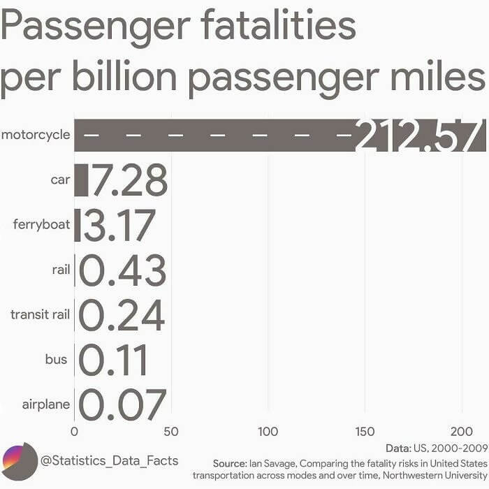
We all hear the warning about seatbelts. They could save your life, so you better put one on. But that's a car issue. What if you are a motorcycle rider? In that case, it might be a good idea to wear a helmet. But how much does that help really? Looking at this chart, it seems the dangers are worse than we knew. Just look at the passenger fatalities. They're terrifying!
The death rates are staggering, compared to all other forms of transportation combined. Motorcycles, be darned. From now on, we're only taking airplanes everywhere. Those turn out to be surprisingly safe!
Which Drunk Food Favorite Reigns Supreme?
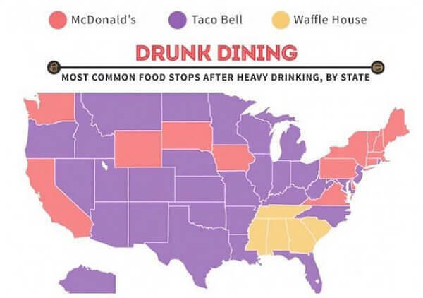
When it's time to leave the bar, very few of us go home. That's the hour of the night when cravings hit the hardest! More than likely, we head to our nearest fast food joint. But where do most people go, compared to us? This map has answered that query, once and for all. And it's helpfully organized by state! In red, we have Mcdonald's. In purple, we have Taco Bell. And finally, in yellow, we have Waffle House.
Just by a quick glance, we can see that Taco Bell is dominating the day. And by day, we mean night. And by dominating, we do mean serving up Cheesy Gordita Crunch combos. Delicioso!
These Presidents Really Helped Expand the USA
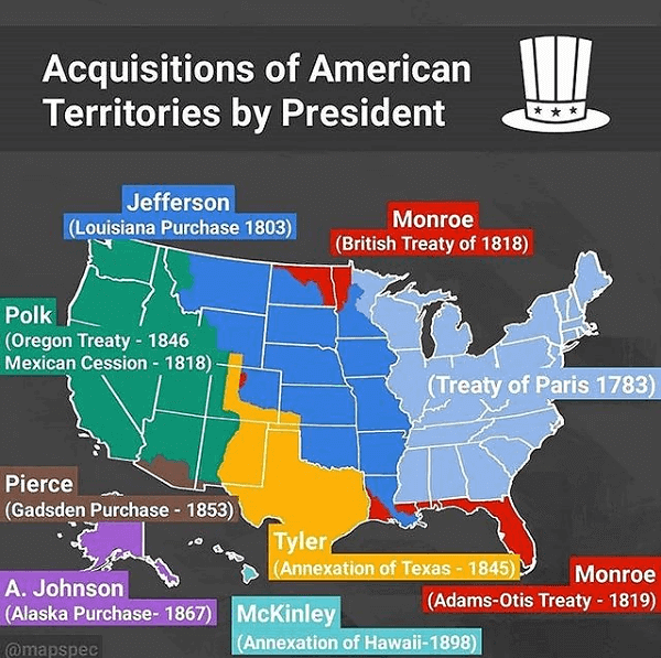
Today, the United States is a union of states. But how did all that come about? We know that the project started out as thirteen colonies on the east coast. Over time, large chunks of land were added to the nation. This map helpfully explains the changes over time and credits the relevant prez. Did you know that President Polk got us half the western USA? We didn't either.
Other major events include Thomas Jefferson's massive Louisiana Purchase and Andrew Johnson's purchase of Alaska by Russia. The Ruskies are probably smacking themselves now for selling it for just $1 million. But the deal is sealed!
The Most Extreme Rotten Tomatoes Critic Vs. Audience Ratings
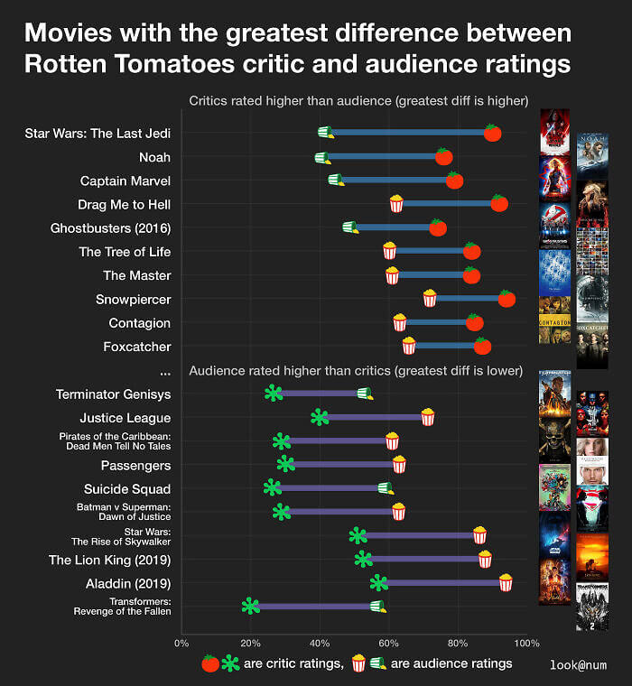
Truthfully, the critics and the audience do not always agree. In recent years, the divide has become bigger and bigger. Are the elites just out of touch? Or do regular folks have no sense of cinema? We will let you decide that question, on your own time. But for now, take a look at the films that had the biggest gap in opinion. Which titles stand out to you most?
Maybe it will be the views on Star Wars: The Last Jedi. The critics loved that one, and the fans hated it. There's also Justice League, which seems to have the opposite rating. Moviegoers loved it, despite the reviews.
The Largest Immigrant Groups in Each U. S. State
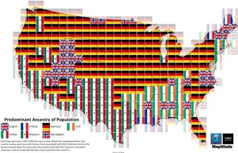
As we know, most American citizens are not indigenous. They are the children of immigrants, looking for a better life in the new world. But which countries sent over the poorest and most tired to Lady Liberty? Tens of millions came and came and came in the 1800s, and changed the population from being primarily British. This pictorial representation explains that history in a colorful way. Are those little European flags? Why, yes. Yes, they are.
Looking at each region, we can see that more people claim German ancestry today in the north than in the south. The opposite is true for Irish and Italians. But it's not like Boston isn't full of Irish lads and New Jersey lacks Italians. And frankly, people are pretty mixed, these days!
The Huge Decrease In Infant Mortality From 1950 To 2020
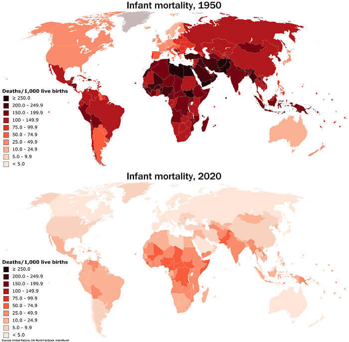
It's hard to imagine how brutal life was before the modern era, but one data point might help us understand a little bit. Back in the day, infant mortality was high. Families would routinely lose half their kids! Today, we don't have to deal with that kind of trauma on a regular basis. With advances in medicine and better nutrition, we can feel proud there's been a major achievement. Take a look at the progress just between 1950 and 2020.
On the map, the darkest red indicates more than 250 baby deaths per 1,000 births. On the light side, the rate is close to zero, at less than 5 per 1,000 births. That's a remarkable shift in only 50 years, worldwide!
How 11 Different Brands of AA Batteries Worked in a Flashlight
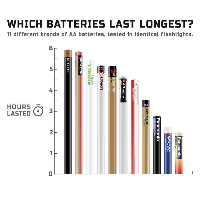
Perhaps solar power is the way of the future to power our homes. The tech isn't ready yet, but it's fun to imagine the possibilities. On a smaller level, we know that solar-powered Christmas lights are already a reality. But that technology is not yet standard for flashlights. We all still buy batteries for things like that, and it's hard to know the brand is the best value. Thanks to this chart, we now know the truth!
Tested in the very same flashlight, this is the data. The runner-up? The Costco brand, Kirkland. At the very top of the head is Duracell. According to that company: “No other battery looks like it. No other battery lasts like it.” For once, a company wasn't lying!
Where the Cattle Really Hang Out By U.S. Counties
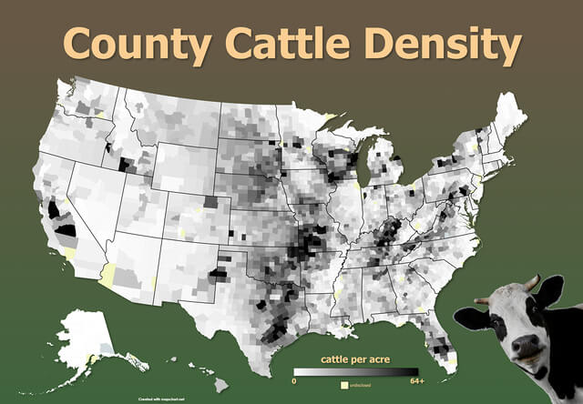
How many cows really live in America? It's time to learn the truth. The beef and dairy industries say it's around 94 million cattle and calves. Most of them are for beef, and not cheese, by the way. But the question is, where do all these animals actually live? That's a whole lot of hooves, but we almost never see them. Let's look at this moo map, organized by density per county.
It looks like the dark areas show more cows in your area, and those are clustered in Texas and the neighboring states, as well as Cali and Wisconsin, most notably. That's not really a surprise if we think about Texas BBQ and the competition for best cheese. California claims to have happier cows, but Wisconsin begs to differ.
The Number of Open Missing Persons Cases per 100k People by State
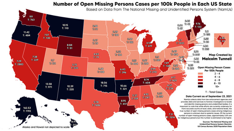
America was totally disturbed by a recent true crime case: Then disappearance, and eventual death of Gabby Petito, a young YouTuber on a trip with her fiance. She was eventually found. But the details were ugly and involved an autopsy, not a tearful reunion. But some wondered how common this kind of thing actually is, these days. And it turns out, there are quite a few people missing, basically at all times.
This chart of the United States helps us see the prevalence of missing persons per 100,000 people. Alaska, New Mexico, Arizona, and Oklahoma are some of the worst examples. Is there something in the water there, or what?
These Countries Have A Higher Life Expectancy Than The USA
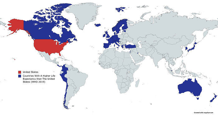
America is number one in a lot of things. NASA is the best space program in the world, and our burgers are the biggest and the greasiest. That second data point might have something to do with the chart here, which measures life expectancy. The USA is not number one, and eating habits may have something to do with it. According to the World Health Organization, these were the countries with a higher life expectancy in 2019.
All the countries highlighted in blue have citizens that live longer. Looking at the map, we see Australia, Chile, and Japan, to name a few. Even Northern neighbor Canada is doing better. What are their secrets?
This Shaded Relief Map of Japan Is Pretty Cool to Look at
If geography is your hobby, take a look at this shaded relief map. These maps are special because they show features on the surface. It's a different way to understand the locations of mountains, valleys, and canyons. We can also clearly see where things are flat. And it's all compared to sea level, as a standard. Here, someone has created an artsy, blue relief map of Japan.
If you look closely, you can see the contrast between Mt. Fuji and Tokyo. From this vantage point, it all looks so tiny. But the truth is massively different, it's safe to say.
Cancer Mortality Vs. Funding by Cancer Type
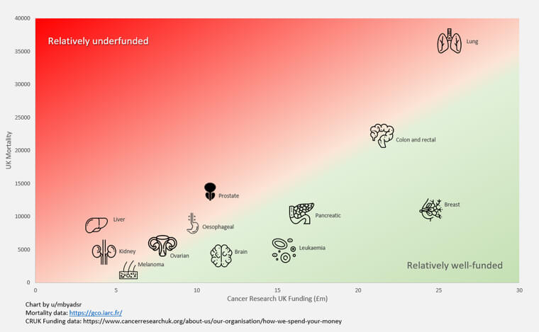
Cancer is a general category of disease none of us ever want to deal with. Whether it's lung, liver, or skin, we really don't need cancer in our lives. We would hope that the scientists are solving all of them, wherever they are in their labs. But truthfully, not all cancer gets the same attention, in terms of funding. According to Cancer Research UK, these are the stats.
The data is definitely striking as a visual representation. Breast gets a lot of money, which seems to be resulting in good treatments. But lung? Not so much, even though plenty are dying. Yikes!
Compare the Positions of All the NFL Hall of Famers
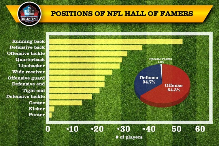
According to legendary NFL coach Lou Holtz; “your talent determines what you can do. Your motivation determines how much you are willing to do. Your attitude determines how well you do it.” But is that really true, when it comes to the all-time hall of fame? It seems that the analyzed data tells a story. Your position on the field seems to play a role in whether or not you get this honor.
The top choice seems to be running back, followed by defensive back. Third, we have offensive tackle, and then quarterback and linebacker. But punter? Dream on! Not gonna happen, in all likelihood.
The Most Popular Female Names by State in the 80’s
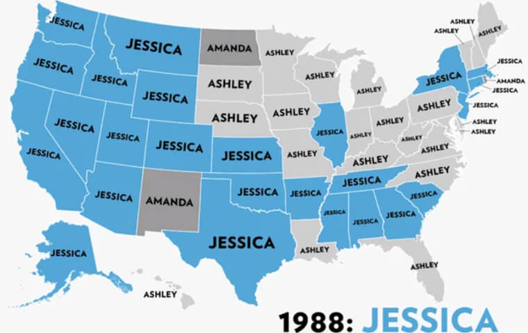
Why are some names so popular in ant given year? There seem to be trends, but no one talked to each other in the hospital rooms. It's a bit mysterious. Experts do have a theory on why certain names rise to the top of the heap, from time to time. In some countries, tradition is king. But in America, most parents want to choose a name that's not too different, yet slightly different. We get it!
Looking back at a chart from 1988, we can see why we know so many grown-up Jessicas today. It seems a lot of folks thought it was catchy and a little original, that year. Little did they know that they weren't alone!
These Are the Highest-Grossing Media Franchises Ever
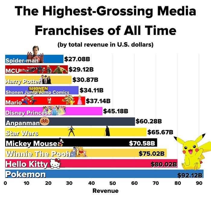
There are those who complain there is nothing original in Hollywood, these days. There's a fair point to be had there, but there's another side of the conversation. Big franchises do so well because they have loyal fans, and those people aren't complaining. It's time to look at the most successful concepts of all time, in terms of total revenue in U.S. dollars. Would you believe that Pokemon is still number one?
We wouldn't have guessed. And just below are Hello Kitty and Winnie the Pooh. We're surprised to see that Star Wars is below these cartoons. The force remains with Pikachu, apparently.
The Number of Murders in California by Day of Week
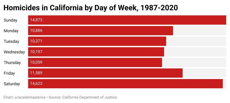
Murder is a sad phenomenon that doesn't seem to be going away anytime soon. We all wish it would, but let's be honest. There are way too many crazy people lurking out there, all the tie. This chat illustrates exactly what has been going on in California, over the years. We wonder what the most murderous day of the week is, and now we have that answer. Would you believe it's Sunday?
Yes, Sunday. The same day millions of Americans go out to church, take the family to an all-you-can-eat buffet, and turn on Sunday Night Football. Goodness gracious.
The Salaries of Teachers vs. Cops in Each State
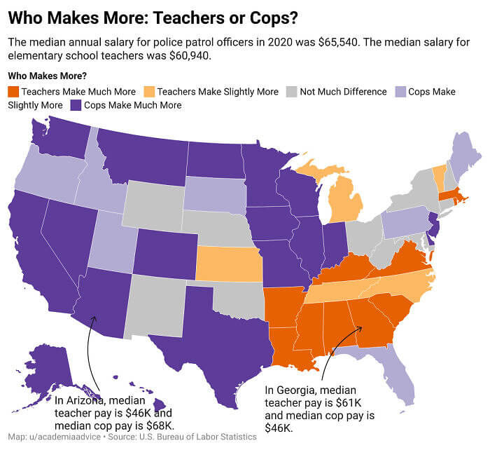
Teachers and cops are two professions present in every community. The reason is simple, folks. You need someone to teach the kids to read, and you need someone to wrangle them in if get a little too wild. We get it. But do we really know how much each job gets paid, all over the country? Now, we have some data to compare with the help of colors and shading.
As we can see, police tend to make more money in more areas of the USA. But there are regions where teachers make much more. If these are your career plans, that's something to think about!
These Are the Average Sunshine Hours of Germany in a Year
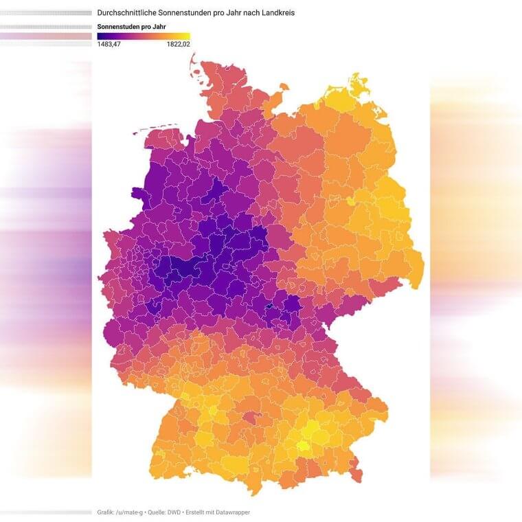
In Germany, citizens enjoy all four seasons. There is a definite winter and summer, and pleasant fall and spring times. But what about the question of sunshine? Some places are naturally cloudier than others. This map colored in the country to show you which regions get the most rays, for these of you who love your vitamin D. It seems there is a general trend that the east gets more sun. Do they also get more fun?
Well, that question can never be answered objectively. Should you prefer Berlin or Cologne? There are certainly pros and cons to each region. But in terms of sun, that question has been definitively answered. The east, it is!
The Google Searches for Emotions Each Hour Are Fascinating
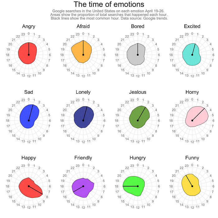
Our emotions change throughout the day. Whether it's all in our head, or events are happening in the real world, we react. We hope the roller coaster isn't too extreme, if possible! But sometimes, we need answers to what's going on with ourselves. Here are the google searches at each hour of the day on that topic. From morning til night, people out there are feeling all kinds of feelings.
Folks seem to be wondering about positive and negatives at all hours of the clock, it turns out. But we do wonder why 1:00 am is the saddest hour. What gives?
Here's How Americans Answer if They Would Rather Be Hot or Cold
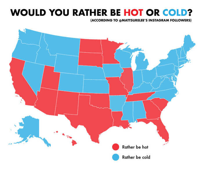
The argument is as old as time. It usually goes on between men and women in the office, and it's impossible to resolve. Do you prefer being hotter or cooler? We all have our own answers. But how does that preference vary by state? Here, a map of the USA seeks to answer exactly that, in red and blue. Sometimes, people are mismatched with their own state. It's a bit surprising!
If you prefer being hotter, why would you locate yourself in Minnesota in the first place? And if people in New Orleans love the cold so much, why did they choose a house in the bayou?
They Sorted Out World Leaders by Age on This Map
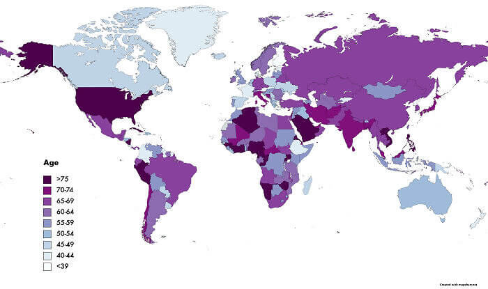
The oldest president in U.S. history is actually Joe Biden, who took the oath at 78. Will the current occupant of the White House hold that record forever? We don't know what the future holds, in terms of elections. But we can look to worldwide trends to see if older is bolder. Here, a map shows us where the younger leaders are right now and contrasts it with the seasoned citizens leading nations.
The lighter the color, the younger the prez. Canada, Australia, and Greenland stand out right now, as far as we can tell. Let's check back in four years and see how the map evolves!
The Percentage of Entry-level Jobs That Require 3+ Years of Experience on LinkedIn
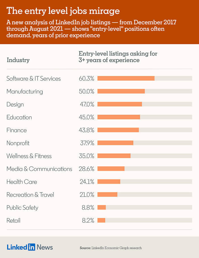
It's a frustration we've all had when applying for jobs. Not enough experience? Next. Too much experience? Overqualified. Looking at LinkedIn, it might seem like nothing is ever the perfect match. One sleuth decided to analyze the ads that claimed to be totally entry-level. He found a strange labeling trend, though. An astonishing number of positions at this level required years of experience. A new definition of entry-level, that's for sure!
We just can't agree with this categorization, bosses. Three years of work is not the same as a fresh college grad. What's going on in the job market, these days?
The Reason You Should Keep Your Knights Near the Middle of the Chessboard
World chess champ Bobby Fischer once said: “Chess is a war over the board. The object is to crush the opponent’s mind.” That's pretty intense, Bobby! We are not sure if we will ever reach his level of passion for the black and white board game. But it is always interesting to see new strategies. Here, you can see the importance of placing one piece: The knight. Which area is the best place to keep it?
Apparently, the middle has a major advantage. Maybe that's because it offers 360 degrees of movement. Maybe it's just because of the way the piece is designed to move. Either way, we are taking the tip.
The Top Five Economies in the World Includes a U. S. State
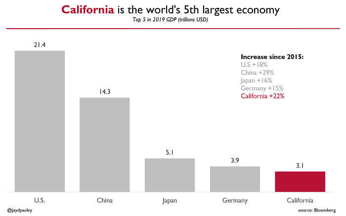
The world is a big, beautiful ball of workers and consumers. There are trillions of dollars floating around thee, and it can be hard to keep track of them all. Where is most of the money, these days? Perhaps one way to answer that question is by looking at the largest economies. The top five appear to be the United States, China, Japan, Germany, and California. Wait, isn't that redundant?
It might seem that way. It even be that way. But it's interesting to divide California as a separate system from the rest of the country for a moment, just to see how massive it really is. If The Golden State ever does break away, it could be a force to reckoned with!
There Are More Cows Than People In These States
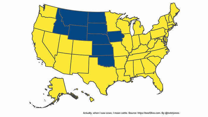
According to the U. S. Department of Agriculture, the average American drinks 18 gallons of milk a year. In the 1970', that number was closer to 30. Perhaps they are supplementing with juices or soymilk, these days. But that's still a lot of moo juice! Where do all the cows live that produce it? According to this map, there are a bunch of states that have more cattle than humans. They're highlighted in blue. Take a look!
There's Iowa, Oklahoma, and Idaho. We also see Kansas, Colorado, and Montana, plus the Dakotas. Truthfully, we knew these places weren't densely populated. But we could never have guessed the cows!
A Colorful Patriotism Comparison of Latin America
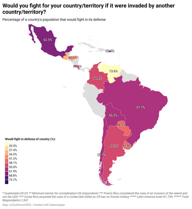
Latin America is a diverse place, to be sure. Sure, most countries speak Spanish. But each place has its own history with government, for good and for bad. Many have had military dictatorships in between revolutions, and back again. Let's check out the surveys on patriotism, in terms of who would currently fight for their country if there was a foreign invasion. Puerto Rico and Mexico seem to have the most volunteers!
On the low end, we see Venezuela and Guatemala are less enthusiastic about the idea of warfare. Or at least their own participation in it. We will need more data to see the full story!
How Water Shortages Have Become Increasingly Bad in California
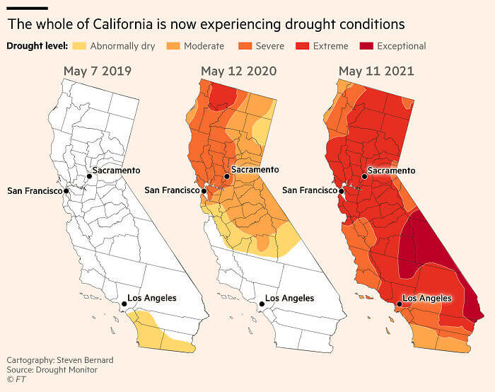
We hear about it all the tie, but he bad the water shortage in Cali? According to the Califonia Department of Water Resources: "California is no stranger to drought; it is a recurring feature of our climate. We recently experienced the 5-year event of 2012-2016, and other notable historical droughts included 2007-09, 1987-92, 1976-77, and off-and-on dry conditions spanning more than a decade in the 1920's and 1930's." Yikes, that bad?
This map shades in the state just over the past few years to show the trend. It's looking dry, on the West Coast, from Sacramento to Los Angeles. We hope the avocados don't shrivel!
People Killed In Terrorist Attacks in Europe Vs. Africa
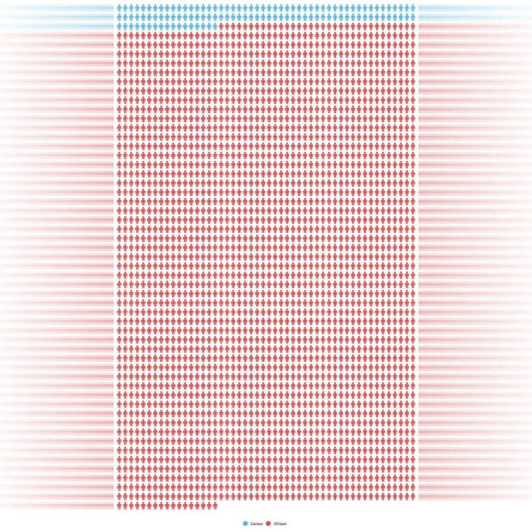
After 9/11, the western world started to hear about terrorism all the tie, Sure, there had been incidents here and there. But mass attacks became a major feature of debate, and we were all terrified for a while. It might be interesting to look at the frequency of terror attacks in Europe and Africa, in blue and red. There have certainly been horrific stories in Europe in recent years. But apparently, we never heard the full story.
It's safe to say that we know Africa can be dangerous. But the constant reality of violence stands out when it is visualized in a color chart. Look at all that red!
The American Map Using 3d Elevation Tiles
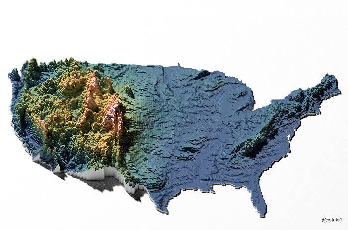
The United States is pretty massive, you guys. It's a country that takes up an entire continent, and there's a lot going on geographically. Between the Atlantic and Pacific Oceans, we see incredibly varied topography. Hills and mountains, giant bodies of fresh water, and the great plains are all different vibes. As the third-largest country in the world, there's something for everyone. Let's take a look at it, from above!
Using 3d elevation tiles, a clever mapper created this picture for us to learn more. We can see the Western U.S. is genrally higher than the other side. The exception? The Appalachian region, of course.
The Percentage of Social Media Content That's Actually Ads
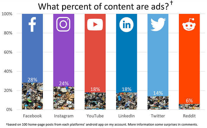
Social media is a trap, in terms of time and energy. But it's so much fun, and we have no plans it seriously give it up. We wonder how much ham marketing is going on, though, as we scroll. The answer is obviously a lot if it's a free service. There has to be a way everything gets paid for, right? This chart offers us a comparison of the major platforms, in colorful bars.
A lot of things we see are really just paid ads. Facebook appears to be the worst offender, at 28% of all content. On the other end, Reddit seems to be the cleanest. Go Reddit, go!
A Poll of Why Digital Transformation Recently Occurred
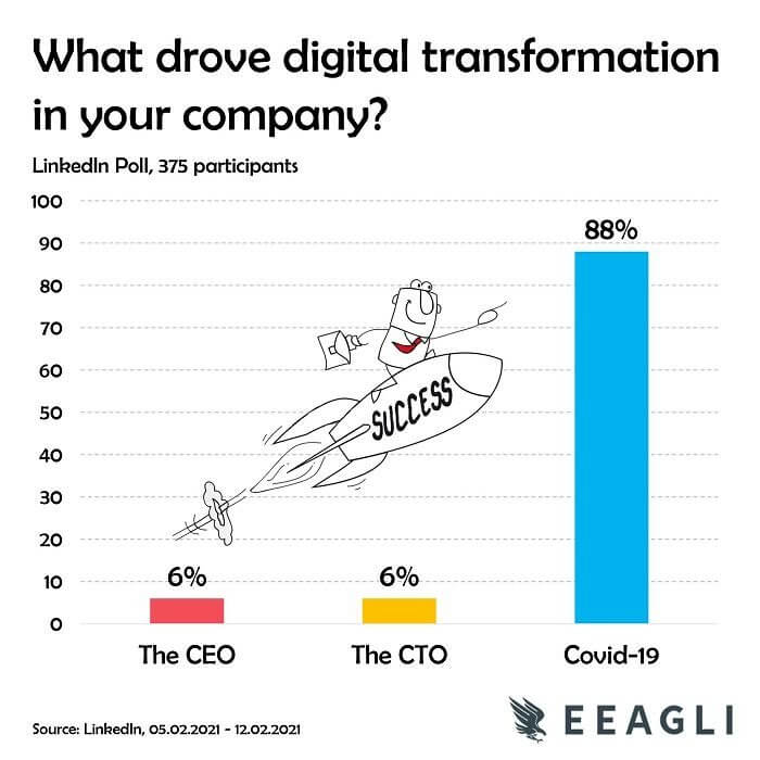
There are all kinds of historical events that drive innovation. As we look back in history, we never saw most of the best changes coming. Like that a germy petri dish led to the discovery of penicillin, and a medical revolution. Be gone, infections! Sometimes, we can't predict what will cause a major change for us humans. Lately, we've noticed that a lot of companies suddenly got a lot more digital. What gives?
According to a recent LinkedIn survey, the pandemic is the real reason so many companies made such a drastic change. It wasn't the bright idea of the CEO or CTO, at random. As they say, necessity is the mother of invention!
The Real Causes of Financial Loss in America
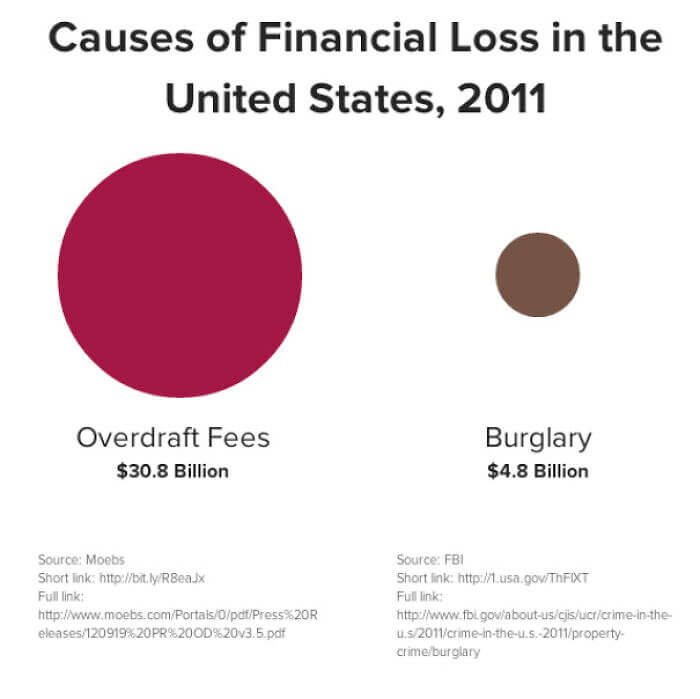
Debt is a dirty word, and Americans sure hold a lot of it. Whether it's the national debt or personal loans, there is more than enough to go around. In 2020, the federal debt was $26.70 trillion. That's trillion, with a T! How will that all be paid back? Nobody knows. But let's look at the individual bills for a moment. What is causing everyday folks to pile on more and more?
According to this chart, overdraft fees are an even bigger culprit of losing money than literal thieves. Look at the size of that red circle on the left representing fees. It's like Jupiter swallowing everything!
Changing Public Opinion of Homosexuality in the United States
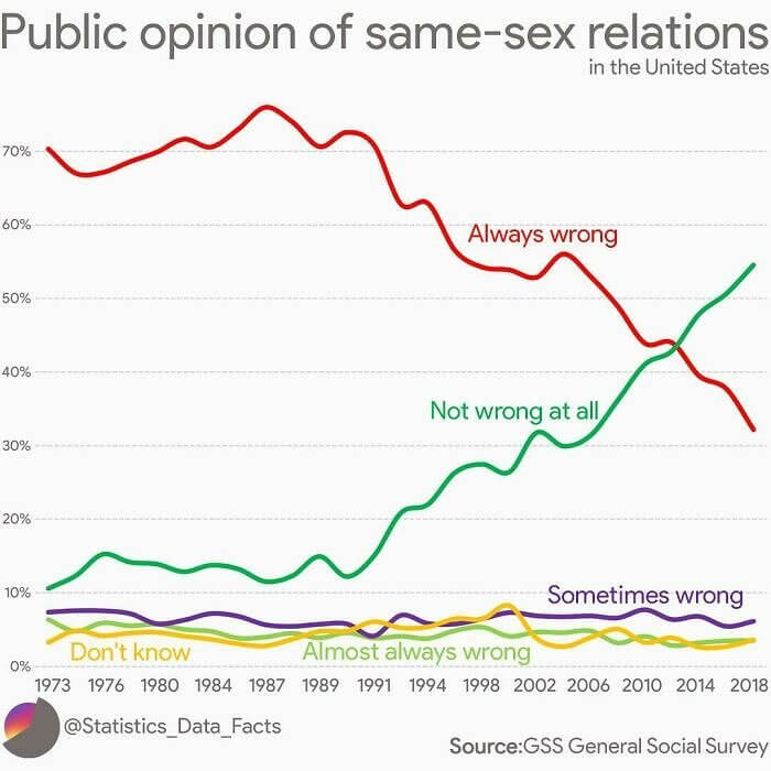
It's hard to believe now, but it was once illegal to be gay in the United States. That is if you ever did anything about it. We're not talking about gay marriage here, to be clear. We are talking about any kind of gay activity, at all. These statues were called sodomy laws, and gays found themselves in prison even in the 1950s. That seems impossible to imagine now, doesn't it?
This chart illustrates the changing attitudes of Americans about gay issues over the past forty years. Starting from the 70's, a lot of people shifted their opinion from always wrong, to sometimes wrong, to not wrong at all. Today, there are still the same range of ideas. But the polls look as different as our laws do, which makes sense.
Check Out the Top Search Terms on Google in 2020
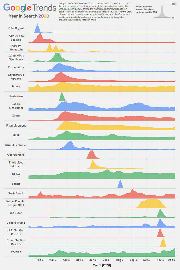
Google began way back in 1996 as a research project by Stanford Ph.D. students, Larry Page and Sergey Brin. Obviously, it has grown a bit since then. And by a bit, we mean a lot! Nobody seems to use anything else when it comes to searching for info online. Sure, there are a few other sites claiming to compete. But do they, really? Looking at the Google trends is a sort of poll, and it's interesting to see the trends. What were most humans searching for, in 2020?
It was a tough year, to be sure. People wanted to know about Kobe Bryant, Beirut, and presidential candidates. They also had a lot of medical questions. We get it, we did too.
A Comparison of Normal Weight BMI by US State
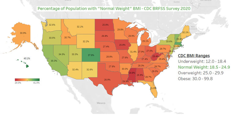
There's no getting around it: America is a big, bold country. Everything is supersized, and that's just the way we like it. But that label now seems to include its residents, too, in terms of the scale. Government stats put around 70% of American adults in the overweight or obese categories. Kids are inching up there, too! This chart aims to illustrate where all of these folks are located, nationwide.
Looking at the largest locales, we see red and orange up and down through the middle of the country. As a contrast, New York and Cali seem to be the thinnest areas on the map. Does this seem accurate to you?
The American Cities With the Best Coffee Shops According to Yelp
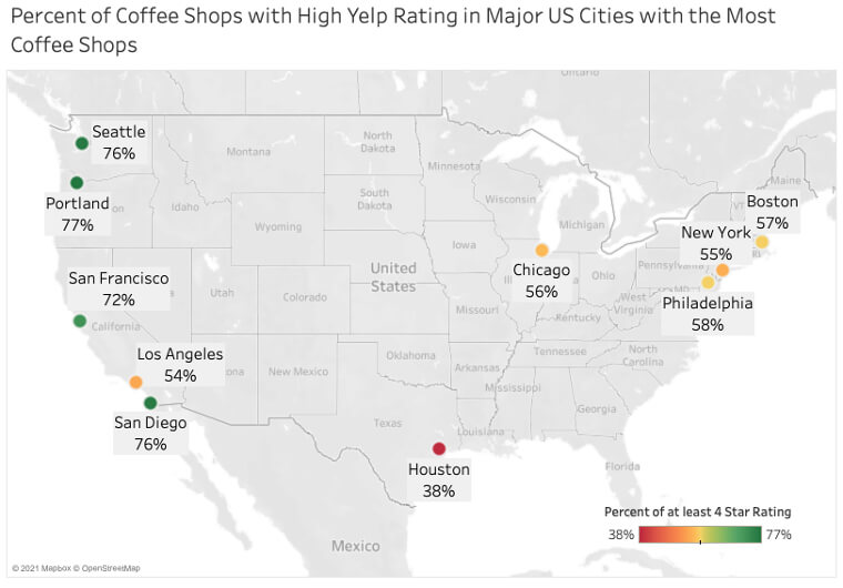
Whether it's decaf or double, every American has their favorite way to get morning joe. The most popular type of coffee in the USA remains the drip style, though. With a machine in every house, that shouldn't be too surprising. But when it's time for something special, everyone has their favorite takeaway. According got Yelp, these American cities have the best local shops. Do you trust Yelpsters? We think they might have some insight.
In general, we see good reviews for the west coast. Major California cities are included, as well as Seattle. That shouldn't be too surprising, though. Seattle is the birthplace of Starbucks, itself. The original is still open, and we hope to visit!
The Number of Horses per Capita Around the Globe
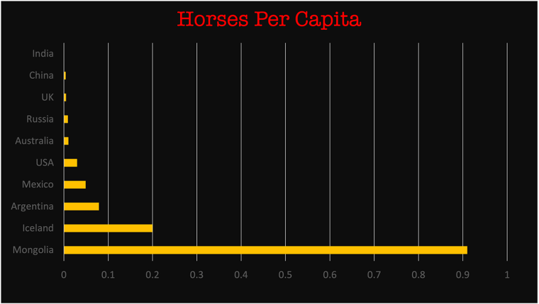
A lot of us are into dogs and cats, these days. But horses have been companions for man for around 6,000 years. That's when they were first domesticated, and many cultures hold them dear. No one loves them like Mongolia, though. Traditional nomads in the central Asian country still have quite a few. More than 3 million mares and steeds roam around, which outnumbers the human population. Look at this chart, for a per capita comparison.
It's no competition, really. India, China, Russia, America — all behind Mongolia. The Kentucky Derby is a big deal, but that's quality over quantity. If Genghis Khan were alive today, we know he would be proud.
The Number of Adults in Jail per 100,000 in the United States
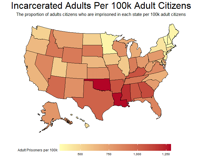
Just how many crooks, criminals, and innocent souls currently sit in American prisons? According to The Sentencing Project: "There are 2 million people in the nation’s prisons and jails—a 500% increase over the last 40 years. Changes in sentencing law and policy, not changes in crime rates, explain most of this increase." We don't know if their thesis is correct, but it's certainly an interesting debate. Let's take a look at where most of these prisoners actually are, for starters.
Looking at this colored map, we can see that the redder you get, the more prisoners there are. The south stands out, in that regard. Minnesota is pretty yellow, on the other end. Is that 'Minnesota nice' stereotype really true?
We Have the Data on Fast Food Drive-thru Speeds
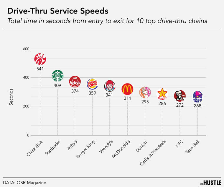
Nobody truly enjoys waiting in lines, in general. When you're trapped in your car, it can get kind of claustrophobic. We expect the best out of our drive-thrus, and we are interested to know the top performers. The candidates: Chick-fil-A, Starbucks, Burger King, Wendy's, Mcdonald's, Dunkin' Donuts, Hardee's, KFC, and Taco Bell. Who will come out on top? We've got the stats, and you might be surprised.
The winner is Chick-fil-A, folks! Sadly, it's not such a glorious win, since this means they take the longest to hand out food to their drive-thru patrons.

